Your biolink background Is Your Brand's First Impression So here we are. You've learned about color psychology, design principles, optimization tactics, and real-world examples of what works.
You've spent hours crafting the perfect Instagram post. Your caption is witty, your hashtags are on point, and you've included that crucial "link in bio" call-to-action. But here's the hard truth: when your followers actually tap through to your bio link, you have approximately 3 seconds to convince them to stay.
That's right—just three seconds.
Research shows that if users can't find what they are looking for within the first 3 seconds on a website, they are likely to leave. In fact, 40% of users will abandon a website that takes more than 3 seconds to load, and the visual impression occurs even faster. Studies reveal that users form opinions in 17 milliseconds—faster than you can blink.
Your bio link background isn't just decorative. It's the silent salesperson working 24/7 to keep visitors engaged, guide them toward your links, and ultimately convert passive scrollers into active customers or followers. Think of it as the storefront window of your digital presence—if it doesn't immediately capture attention and communicate professionalism, potential customers will walk past.
The Data Doesn't Lie: Backgrounds Impact Your Bottom Line

Still not convinced that your background choice matters? Let the numbers speak for themselves.
Optimized link-in-bio pages generate 25-40% higher conversion rates compared to basic single-link setups. That's not just a marginal improvement—it's the difference between mediocre results and truly seeing your social media efforts pay off. Even more impressive, optimized bio links can increase click-through rates by up to 350% compared to traditional single links.
Consider this scenario: If you have 10,000 Instagram followers and get 1% to 3% of those followers to convert and click your link, that's 100 to 300 potential paying customers. Now imagine improving that conversion rate by even 25% through better design choices, including your background. That's an additional 25-75 potential customers—all from one simple optimization.
The conversion funnel tells an even more interesting story. Only 3-5% of video viewers visit profiles, 10-20% of profile visitors click bio links, and 0.5-3% of link clicks convert to actual purchases or sign-ups. Every percentage point matters when the margins are this tight, which is why creating an environment that reduces friction and increases trust is critical.
What Users Really Want in 2026

Today's social media users are sophisticated. They've seen thousands of bio link pages, and they can spot generic, low-effort designs instantly. They're looking for three key things within those critical first seconds:
1. Visual Clarity: Can they immediately understand what you offer and where to click? Your background needs to create contrast and hierarchy, not compete with your actual links for attention.
2. Brand Authenticity: Does your bio link feel like an extension of your brand, or does it look like you grabbed a random template and called it done? Consistency builds trust, and consumers admit to making judgments on a company's credibility based on the company's website design.
3. Mobile Optimization: Since the vast majority of social traffic comes from mobile devices, your background needs to look impeccable on smaller screens. A background that looks stunning on a desktop but pixelated or slow to load on mobile is worse than having no custom background at all.
When you're learning how to create a pro bio link, understanding these user expectations is paramount. Your background choice isn't about following design trends blindly—it's about creating an environment where visitors feel comfortable, engaged, and motivated to explore what you're offering.
First Impressions Are Everything (And You Don't Get a Second Chance)
Princeton psychologists discovered something fascinating: it only takes a tenth of a second to form an impression of a stranger from their face, and longer exposures don't significantly alter those initial impressions. The same principle applies to your bio link page.
Your background is the foundation of that first impression. It sets the tone, establishes the mood, and signals whether you're professional, creative, trustworthy, or innovative. A cluttered, mismatched, or generic background suggests carelessness. A thoughtfully designed background that complements your brand and content signals that you pay attention to details and care about your audience's experience.
Think about it this way: when someone clicks "link in bio," they're taking action. They've moved beyond passive scrolling to active engagement. This is your moment to deliver on that investment of attention. Your background either rewards their curiosity or confirms their worst suspicions that clicking wasn't worth their time.
The good news? You don't need to be a professional designer or invest thousands in custom graphics to create an effective bio link background. But you do need to understand the principles behind what works—and more importantly, why it works.
In this comprehensive guide, we'll walk through everything you need to know about choosing a suitable bio link background. From understanding different background types and color psychology to mobile optimization and real-world examples, you'll discover exactly how to create a background that not only looks great but actually improves your conversion rates.
Whether you're exploring different bio link platforms or looking for the perfect bio link template, the principles we'll cover apply universally. Let's dive in and transform that crucial piece of digital real estate into a conversion machine.
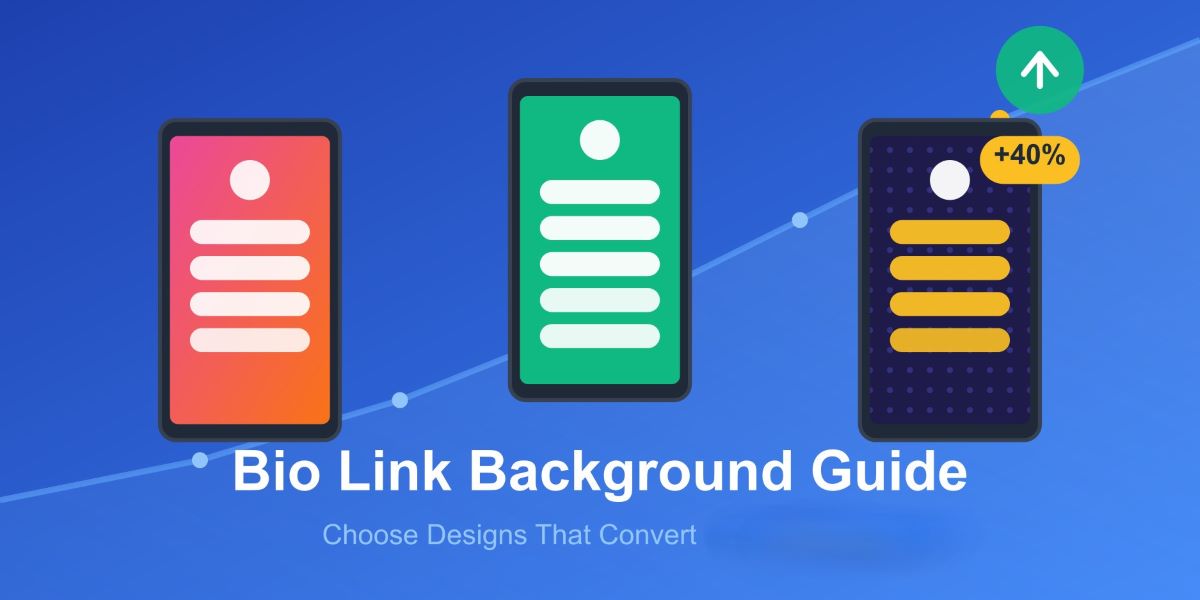
2. Understanding Bio Link Background Types
When you're setting up your bio link page, one of the first decisions you'll face is choosing which type of background to use. Each option comes with its own advantages, technical considerations, and visual impact. Let's break down the four main types.
Solid Color Backgrounds
Solid colors are the workhorses of bio link design—simple, reliable, and effective when done right. They load instantly, look identical across all devices, and create a clean canvas for your links to shine.
When to use them: If your brand identity is already strong and your links need to be the star of the show, solid colors work beautifully. They're particularly effective for professional services, coaches, consultants, and anyone whose content speaks for itself.
The trade-off: Without thoughtful color selection, solid backgrounds can feel generic or boring. The key is choosing a color that aligns with your brand personality while maintaining high contrast with your text and buttons.
Gradient Backgrounds
Gradients add depth to a design by creating smooth transitions between two or more colors, making otherwise flat interfaces feel dynamic and modern. Instagram's bold gradient logo rebrand proved that gradients can signal a premium, contemporary brand identity.
Subtle two-stop gradients like #FFFFFF to #F6F9FB are effective, while heavy multi-color gradients can add unnecessary weight and fail compression. The sweet spot is using 2-3 colors maximum with smooth transitions.
Pro tip: Position your gradient strategically. A gradient that moves from dark to light can naturally guide the eye down your page, creating a visual hierarchy that leads visitors through your links in order.
Image & Photo Backgrounds
High-quality images can instantly communicate your brand's vibe—whether that's adventure, elegance, creativity, or professionalism. However, images require careful optimization to avoid slow loading times.
Technical specs: Aim for 1440x1000 pixels minimum for a sharp display across devices. Keep file sizes under 500KB through compression without sacrificing quality. Use JPG format for photos and PNG for graphics with transparency.
The golden rule: Your image should create atmosphere, not compete for attention. Slightly blur or darken your background image so text remains crisp and legible.
Video & Animated Backgrounds
Want to make a memorable first impression? Animated backgrounds add movement and energy that static images simply can't match. However, they come with performance considerations.
Keep video files under 5MB, use 15-30 second loops, and always include a static fallback image for slower connections. Most importantly, ensure animations enhance rather than distract from your core message.
When exploring different bio link platforms, check which background types each platform supports natively—not all tools offer video or advanced gradient options.
3. Color Psychology for Bio Link Backgrounds

Here's something most people don't realize: the color you choose for your bio link background isn't just about what "looks nice." It's a psychological trigger that happens before your visitor even reads a single word.
Colors can influence up to 90% of an initial impression, and color affects 85% of consumers' choices when making purchases. That's a massive influence happening in those critical first seconds we talked about earlier.
Let me break down what this means for your bio link page.
How Different Colors Affect Visitor Behavior
Think about the last time you saw a bright red "SALE" sign. You probably felt a little jolt of urgency, right? That's color psychology at work, and it's incredibly powerful on your bio link page too.
Blue is the heavyweight champion of trust and reliability. There's a reason why financial institutions like Chase, Citibank, and Bank of America all use blue as their primary color—it symbolizes trust, loyalty, wisdom, and stability. If you're a coach, consultant, or service provider where trust is everything, blue backgrounds can subconsciously signal that you're dependable.
Red creates urgency and excitement. In fact, a HubSpot study found that red CTAs outperformed green ones by 21% in A/B tests. However—and this is crucial—context matters. That same study showed green performed better for eco-friendly products because it aligned with user expectations.
Green communicates growth, health, and eco-friendliness. It's perfect for wellness coaches, sustainability brands, or anyone in the health space. Green also means "go" psychologically, which can encourage clicks.
Orange is your attention-grabber. Vibrant hues such as red, yellow, and orange demonstrate high efficacy in grabbing users' attention, making them ideal for creators who want to stand out and convey energy.
Black signals luxury, elegance, and sophistication. High-end brands, photographers, and luxury service providers can use black backgrounds to immediately communicate premium positioning.
Matching Colors to Your Niche
The smart play isn't just picking your favorite color—it's choosing colors that match what your audience expects from your industry while still expressing your unique personality.
If you're exploring different bio link templates, you'll notice successful creators match their color psychology to their brand purpose. A fitness coach might use energetic oranges and reds, while a meditation teacher would lean toward calming blues and greens.
4. Common Bio Link Background Mistakes (And How to Avoid Them)
Look, I get it. You're excited to create something beautiful, something that represents your brand perfectly. But in that excitement, it's easy to make mistakes that actually hurt your conversion rates rather than help them.
Let me walk you through the biggest background blunders I see creators making—and more importantly, how to fix them.
Mistake #1: Too Busy or Distracting Patterns
A common mistake is using large background images that look great on desktop and tank performance on phones. Your background should never compete with your links for attention. If someone lands on your page and their eyes dart around trying to figure out where to look, you've already lost them.
The fix: Choose backgrounds that create atmosphere rather than becoming the focal point. If you love a particular image, consider blurring it slightly or reducing its opacity so your links remain the stars of the show.
Mistake #2: Poor Contrast and Unreadable Text
This one's a conversion killer. If visitors have to squint or struggle to read your link text, they'll bounce faster than you can say "bio link background." Your beautiful aesthetic means nothing if people can't actually use your page.
The fix: Test your background with your link colors on multiple devices. A good rule of thumb is to use dark text on light backgrounds or light text on dark backgrounds. Avoid medium-tone backgrounds with medium-tone text—it's a readability nightmare.
Mistake #3: Overcrowded Layouts
Stick to 5-7 essential links for clarity. When you add too many links against a complex background, you create visual chaos. Remember, overloading with options prevents user confusion.
The fix: Be ruthless with your link selection. Your bio link page isn't a dumping ground for every URL you've ever created. Pick your top priorities and let your background breathe.
Mistake #4: Ignoring Mobile Optimization
Here's a stat that should wake you up: most users access social media on their phones, yet so many creators design their bio links on desktop and never check how they look on mobile. That stunning high-res image? It might be taking 10 seconds to load on a phone, killing your conversions.
The fix: Design mobile-first. Check your page on your actual phone before publishing. Compress your images. Keep file sizes reasonable. Speed matters more than you think.
Mistake #5: Stale, Outdated Content
Nothing screams "I don't care" like a bio link background promoting last year's event or featuring content that's no longer relevant. A static page with outdated links signals neglect and reduces trust.
The fix: Schedule quarterly audits of your bio link page. Update your background seasonally or when launching new campaigns. Fresh content signals that you're active and engaged with your audience.
When you're figuring out how to create a pro bio link, avoiding these mistakes is just as important as implementing best practices. Sometimes knowing what not to do is more valuable than chasing every new trend.
5. Matching Your Background to Your Brand Identity
Here's the thing about brand consistency—it's not optional anymore. A customized link in bio elevates your business' visual identity with your brand's fonts, colors, images, and design elements to create a memorable first impression Liinks in Bio.
Think about brands like Nike or Apple. You recognize them instantly, right? That's because every touchpoint—from their website to their social profiles—speaks the same visual language. Your bio link should do the same.
Ardent Market offers meaningful goods for slow living, and the store's link in bio aligns perfectly with that vision, showcasing a thoughtfully curated list of links that reflect their brand story Eclincher. That's what you're aiming for—a background that feels like a natural extension of everything else you do.
When selecting your background, ask yourself: Does this match my Instagram aesthetic? Would my audience recognize this as "me" without seeing my name? If you're unsure, stick to your brand colors. High-contrast color combinations not only make your text readable but also reinforce your visual identity Ladybugz.
Whether you're browsing bio link templates or creating something custom, consistency builds trust. And trust converts.
6. Tools & Resources for Creating Bio Link Backgrounds
Alright, so you're convinced that your background matters. You understand color psychology, you know what mistakes to avoid, and you're ready to create something amazing. But here's the million-dollar question: where do you actually make this thing?
Good news—you don't need expensive software or a design degree. Let me walk you through the best tools and resources that'll have you designing like a pro in no time.
Design Platforms That Make It Easy
Canva: The Swiss Army Knife of Design
If you're not using Canva yet, you're missing out on one of the most powerful (and free!) design tools available. Canva's bio link website templates are fully customizable, allowing you to tweak fonts, colors, and design elements to match your brand WebWave.
Here's what makes Canva perfect for bio link backgrounds:
- Massive template library: Simply search for "bio link website" and choose from Canva's suggested templates or create your own design from scratch Eclincher. No more staring at a blank canvas wondering where to start.
- Built-in elements: Need icons, shapes, or decorative elements? Canva's library has millions of options. You can add animations, adjust colors, resize elements—all with simple drag-and-drop functionality.
- Mobile preview: Canva's preview feature lets you see how your media looks on different devices Dribbble, which is crucial since most of your traffic will be mobile.
- Brand Kit feature: If you have Canva Pro, you can save your brand colors, fonts, and logos. This means consistent branding across all your designs in literally two clicks.
One insider tip: The Canva link can be long and ugly, but you can use Bitly to create a shortened, cleaner link Digital Synopsis that looks more professional in your bio.
Adobe Color: Your Color Palette Generator
Struggling to choose colors that work together? Adobe Color (formerly Adobe Kuler) is a free tool that generates harmonious color palettes based on color theory. You can explore trending palettes, create custom ones, or extract colors from images you love.
Just upload a photo that represents your brand vibe, and Adobe Color will pull out a perfect 5-color palette you can use for your background and design elements.
Where to Find Stunning Background Images

Look, not everyone has a library of professional photos sitting around. That's where these free stock photo sites come in clutch:
Unsplash
Unsplash offers beautiful, free images and photos that you can download and use for any project—better than any royalty-free or stock photos Adam Connell. The quality is genuinely stunning, and thousands of new images are added every day, completely free to use with high-quality content Solo.
Search for abstract backgrounds, textures, or themed images that match your niche. A lifestyle coach might grab a serene nature shot, while a tech consultant could use geometric patterns or cityscapes.
Pexels
Similar to Unsplash, Pexels offers millions of high-quality royalty-free stock images with no attribution required Liinks. The search functionality is excellent, and you can filter by orientation (crucial for mobile-first design) and color.
Pixabay
Pixabay provides over 5.9 million stunning free images to use anywhere, all royalty-free with no attribution required Vonza. They also have illustrations and vector graphics, which can be perfect if you want something more stylized than a photo.
Pro tip: When searching these sites, use keywords like "minimal background," "texture," or "gradient" rather than busy scenes. Remember, your background should enhance your links, not compete with them.
Bio Link Tools with Built-In Background Customization
If you're exploring different bio link platforms, you'll find that many come with built-in background options. Here's what to look for:
Native customization features: The best platforms let you upload custom images, choose from gradient presets, or apply solid colors—all without leaving the platform.
Performance optimization: Good platforms automatically compress and optimize your background images so they load quickly on mobile devices. This is huge because doing it manually can be technical and time-consuming.
Template libraries: Some platforms offer pre-designed templates where the background is already optimized and tested. These can be great starting points that you customize with your own branding.
When comparing free versus paid features, background customization is often where the differences show up. Free tiers might limit you to solid colors or basic templates, while paid plans unlock custom images, videos, and advanced gradient options.
Quick Resource Checklist
Here's your go-to toolkit for creating amazing bio link backgrounds:
✅ Canva – For designing custom backgrounds and complete bio link pages
✅ Adobe Color – For generating professional color palettes
✅ Unsplash/Pexels/Pixabay – For free, high-quality background images
✅ TinyPNG or Compressor.io – For compressing images without losing quality
✅ Bitly – For shortening long URLs if needed
✅ Your smartphone – Seriously, for testing how everything actually looks to your audience
The beauty of these tools is that they're either completely free or offer robust free tiers. You don't need to invest hundreds of dollars to create a professional bio link background that converts.
7. Step-by-Step: Choosing Your Perfect Background
Okay, let's get real for a second. You've read about color psychology, design mistakes, and all the theory. But right now, you're probably staring at your screen thinking, "That's great and all, but where do I actually start?"
I get it. Analysis paralysis is real, especially when you're trying to make your bio link look professional while also representing your unique brand. So let's break this down into a simple, actionable process you can follow today—no overthinking required.
Step 1: Define Your Brand Personality and Goals
Before you even open Canva or browse stock photos, pause and ask yourself: What's the vibe I'm going for here?
Are you a high-energy fitness coach who wants to radiate motivation and intensity? Then you're probably not going for soft pastels and minimalist whites. Are you a wellness practitioner helping people find peace and balance? Then neon gradients and bold patterns might send the wrong message.
Choose a pre-designed theme with a background that aligns with your brand's personality and resonates with your audience, giving them a glimpse of who you are before they engage with your content.
Write down three words that describe your brand. Mine might be "authentic, energetic, helpful." Yours might be "luxurious, minimal, professional" or "playful, creative, bold." These words will be your north star through every decision that follows.
Now think about your goal. Is this bio link meant to drive product sales? Build your email list? Get podcast downloads? Your background should support that goal, not distract from it.
Step 2: Research Your Audience Demographics and Preferences
Here's where you play detective. Who's actually clicking through to your bio link?
If you're targeting Gen Z on TikTok, they're expecting something vibrant, trendy, and a little edgy. They've grown up with high-quality visuals and can smell a generic template from a mile away.
If you're serving corporate executives on LinkedIn, they're looking for clean, professional, trustworthy design. That wild gradient with five colors? Probably not the move.
Look at your Instagram insights or TikTok analytics. What's the age range? Where are they located? What other accounts do they follow? Then—and this is key—check out those accounts' bio links. I'm not saying copy them, but notice patterns. What backgrounds are working in your niche?
Step 3: Choose Your Background Type
Based on Steps 1 and 2, pick your weapon:
Go with a solid color if: You want lightning-fast loading, you have strong visual content in your links already, or your brand is minimalist and professional.
Choose a gradient if: You want something more dynamic than solid colors but still clean and modern. Gradients work especially well for creative industries and younger audiences.
Use an image if: Your brand is highly visual, you have professional photography that represents your vibe, or you want to immediately establish a specific mood or setting.
Try video/animation if: You're willing to put in the extra work for optimization, your audience expects premium experiences, and you're confident it won't slow down your page.
Most people actually do best starting with either a solid color or a subtle gradient. You can always level up to images or video later once you've nailed the basics.
Step 4: Select Colors Based on Psychology and Brand
Remember that color psychology section? Time to put it into action.
Pull up your brand colors. If you don't have official brand colors yet (no judgment—we all start somewhere), choose 2-3 colors that feel right based on what you learned earlier.
Here's my shortcut method: Go to Adobe Color, find a palette you love that matches your vibe, then test it by creating a quick mockup. Does it feel like you? Does it support readability? Does it match the emotional response you want?
For solid backgrounds, pick your primary brand color. For gradients, use your primary and secondary colors with a smooth transition. Choose a theme, add custom colors, or upload a background image depending on which platform you're using.
Step 5: Ensure High Contrast for Readability
This step is non-negotiable. I don't care how beautiful your background is—if people can't read your link text, you've failed.
Here's the test: Take a screenshot of your bio link page and show it to someone for exactly two seconds. Can they immediately tell you what the page is about and where to click? If not, you have a contrast problem.
White or light text needs dark backgrounds. Black or dark text needs light backgrounds. And if you're using an image background, add a semi-transparent overlay to increase contrast. Most bio link platforms have this built in—use it.
Step 6: Optimize for Mobile Performance
Remember, most social traffic comes from mobile devices, so this step is critical.
If you're using an image, compress it. Use tools like TinyPNG or Compressor.io to reduce file size without killing quality. For best results, choose an image up to 2048 pixels wide, but keep the file size under 500KB.
Then—and I can't stress this enough—open your bio link on your actual phone. Not just the mobile preview in your browser. Your actual phone. How does it look? How fast does it load? Can you read everything clearly?
Test on both iOS and Android if possible. Sometimes colors display differently across devices.
Step 7: Test and Gather Analytics
You're not done after you hit publish. In fact, that's when the real work begins.
Most bio link platforms include basic analytics. Track your click-through rates for the first week. Are people bouncing immediately? That might signal your background is too distracting or slow to load.
Are they clicking through to your links? Great! But which ones? Are certain links getting ignored because they're getting lost against your background?
Give it at least a week of data before making changes. Sometimes our artistic preferences don't match what actually converts, and that's okay. Data doesn't lie.
Step 8: Update Regularly Based on Campaigns
Your bio link background isn't set in stone. In fact, the best creators update regularly to stay fresh and support specific campaigns.
Launching a new product? Update your background to match that product's branding. Holiday season? Add some seasonal touches. Pivoting your content strategy? Your background should evolve with you.
Edit the title and description to your liking, and you can even stand out by using a GIF or MP4 for your background or avatar when you want to make a bigger impact.
Think of your bio link like a storefront window display. The best stores update their windows regularly to reflect what's happening right now. Your background should do the same.
The Real Talk: You'll Probably Change It
Here's something nobody tells you: your first bio link background probably won't be your last. And that's totally fine.
I've changed mine at least five times in the past year. Each time, I learned something new about what my audience responds to, what looks good on mobile, and what actually drives clicks.
The key is to start. Choose something that feels 80% right, publish it, and iterate based on real feedback and data. Perfection is the enemy of progress, and in the world of creating a pro bio link, testing and adapting beats overthinking every single time.
So pick your background type, follow these steps, and get it out there. Your first version doesn't need to be perfect—it just needs to exist.
8. Real Examples & Case Studies: What Actually Works
Alright, enough theory. Let's get into the juicy stuff—real creators and businesses who are crushing it with their bio link backgrounds, and what we can learn from their choices.
Because here's the truth: you can read all the design principles in the world, but nothing beats seeing what's actually working in the wild right now.
Example 1: Jessica Hische - The Power of Playful Contrast
Jessica Hische is an illustrator who knows a thing or two about visual design. And her bio link background? It's a masterclass in strategic color choice.
Being an illustrator, Hische has worked to create a bio link page that emphasises her portfolio and personal projects with a pretty clear juxtaposition—the links themselves are bright orange, in your face, and yet the background is a soft pink.
Why does this work so brilliantly? That orange-on-pink combination creates instant visual hierarchy. Your eye knows exactly where to look. The soft pink background creates a playful, creative atmosphere that screams "artist," while the bold orange links demand clicks.
The lesson: Don't be afraid of bold color combinations. If your links pop against your background, you've already won half the battle. Jessica's page proves that "professional" doesn't have to mean boring neutrals.
Example 2: Natalie Franke - Results That Speak for Themselves
Here's a case study that'll make you want to optimize your bio link immediately.
Being a bestselling author, Franke takes a direct route to sales on her link in bio, with the top two links leading straight to her product pages, resulting in a 1,042% increase in subscriber conversion just two days after launching it.
Yes, you read that right. A 1,042% increase. That's not a typo.
While the article doesn't detail her exact background choice, the key insight here is that her bio link design—including the background—supported her primary goal: driving sales. Everything on the page was optimized for conversion, not just aesthetics.
The lesson: Your background should support your business goals. If you're driving sales, your background needs to build trust and guide visitors toward purchase buttons without distraction. Function first, beauty second (although you can definitely have both).
Example 3: Ardent Market - Brand Consistency in Action
Sometimes the best background is one that tells your brand story at a glance.
Ardent Market offers meaningful goods for slow living, and the store's link in bio aligns perfectly with that vision, showcasing a thoughtfully curated list of links that narrate their brand story while providing easy, efficient access to its products.
Their background immediately communicates their brand values—slow living, mindfulness, and intentionality. You don't even need to read the text to understand what they're about because the visual atmosphere does the heavy lifting.
The lesson: Your background is storytelling. It should communicate your brand essence before someone reads a single word. If you're a wellness brand, your background should feel calming. If you're a fitness coach, it should radiate energy. Match the vibe to the value.
Example 4: Aaron Draplin - Bold and Unapologetic
Aaron Draplin is a legendary graphic designer, and his bio link reflects his design philosophy perfectly.
Being a graphic designer, Aaron Draplin's link in bio reflects his bold, no-nonsense style, with great fonts, vibrant colours, and a clean layout that mirrors the clarity and precision seen in his own design work.
Draplin doesn't play it safe with a white background and standard blues. He uses vibrant colors and bold typography because that's who he is. His background screams confidence and creativity.
The lesson: If you have a strong personal brand or distinctive style, your bio link background should amplify it, not dilute it. Authenticity converts better than playing it safe and looking like everyone else.
Example 5: LaShonda Brown - Strategic Cross-Platform Growth
LaShonda Brown demonstrates how to use your bio link background as part of a larger content strategy.
LaShonda uses her link in bio to attract visitors with a freebie, but on top of that, she also prioritises her YouTube channel and cross-platforms her content to ensure followers can engage with her across multiple channels.
Her background doesn't compete with her multiple CTAs. Instead, it creates a cohesive frame that guides visitors through her offerings without overwhelming them.
The lesson: If you're managing multiple platforms and offerings, your background needs to be clean and organized enough to support that complexity. Too busy a background + too many links = instant overwhelm. Keep it simple so your content can shine.
What These Examples Have in Common
Notice any patterns? Let me break down the five traits that all these successful bio-link backgrounds share:
1. Brand Alignment: Every single example reflects the creator's brand personality. There's no generic template vibe here.
2. Strategic Color Use: Whether it's Jessica's orange-on-pink or Draplin's bold palette, color is intentional, not random.
3. Mobile-First Thinking: These creators know their audience is viewing on phones, so their backgrounds load fast and look great on small screens.
4. Clear Hierarchy: The backgrounds create atmosphere without competing with the actual links. The CTAs are always the star.
5. Purpose-Driven Design: Each background supports specific business goals—whether that's building trust, driving sales, showcasing creativity, or growing cross-platform presence.
Industry-Specific Background Strategies
Let's get specific about what works in different niches, based on real-world success:
For E-commerce & Product Sellers: Clean, professional backgrounds that build trust. Beauty brands often use product images as background banners to immediately showcase what they sell. The background becomes part of the product presentation.
For Content Creators & Influencers: Digital creator Taylor Loren directs her audience to her vast offerings through links to her newsletter, freebies, workshop, upcoming course waitlist, online shop, and website. Her background is clean and organized to support multiple CTAs without visual chaos.
For Service Providers: Family photographer Emmy & Ollie Photo uses a link in bio to drive traffic to strategic pages, including her blog, homepage, and specific service pages, with a personal thank you note that shows care for clients. The background enhances that personal, professional feel.
For Coaches & Consultants: Simple, trust-building backgrounds in professional colors. Nothing too flashy, but definitely not generic either. The sweet spot is approachable professionalism.
The "Anti-Generic" Movement
Here's something worth noting: WebWave users are rejecting standard links in bio that look like "just buttons on a monochrome background," choosing instead vibrant, unique designs that capture their brand's essence.
This tells us something important about where bio link design is heading—audiences are tired of cookie-cutter pages. They want personality. They want to feel like they're connecting with a real person or brand, not just another template user.
Your background is your opportunity to differentiate. Don't waste it trying to look like everyone else.
Quick Wins You Can Implement Today
Based on these real examples, here are three things you can do right now:
1. Do the contrast test: Open your bio link on your phone. Can you immediately see where to click? If not, adjust your background colors or add a semi-transparent overlay.
2. Check your brand alignment: Does your background match your Instagram aesthetic? If someone jumped from your feed to your bio link, would it feel cohesive or jarring?
3. Simplify ruthlessly: Count your links. If you have more than 7-8, you might be overwhelming visitors. A clean background can't save a cluttered layout.
Remember what we're seeing from successful creators: backgrounds that enhance, not distract. Backgrounds that tell your brand story instantly. Backgrounds that make clicking feel natural and trustworthy.
That's what converts. That's what these examples prove works in the real world, not just in design theory.
9. Testing & Optimization: Making Data-Driven Decisions
Here's where most creators drop the ball: they design a beautiful background, hit publish, and never look at it again. That's leaving money on the table.
Your bio link background isn't a "set it and forget it" situation. It's a living, breathing part of your marketing strategy that needs regular optimization based on actual data.
What Metrics Actually Matter
A strong CTR generally falls between 1-5%, though this varies by industry and content type. If you're below 1%, your background might be part of the problem—maybe it's too distracting, loading too slowly, or creating poor contrast with your links.
Focus on these key metrics:
Click-Through Rate (CTR): Track click-through rates, average time on page, bounce rates, conversion rates by link position, and peak engagement times. Your background affects all of these.
Bounce Rate: If people are landing and leaving immediately, your background might be creating confusion or looking unprofessional. High bounce rates signal something's wrong with that first impression.
Time on Page: A good background keeps people engaged. If visitors are spending under 5 seconds, they're not even reading your links.
A/B Testing Your Background
Want to know what actually works? Test it. With CTRs, click comparisons, and traffic breakdowns, your bio link becomes a mini analytics dashboard.
Try testing solid color vs. gradient, different color combinations, or image vs. no image. Run each variation for at least 1-2 weeks to get accurate data—don't change things daily or you'll never know what made the difference.
Most modern bio link tools include built-in analytics, so you don't need expensive third-party software. Use what you've got and let the data guide your decisions.
The Optimization Cycle
Think of optimization as a loop: test, measure, adjust, repeat. Experiment with different link arrangements, button colors, and call-to-action text to see what resonates best with your audience.
Your audience evolves. Your content evolves. Your background should too. Schedule quarterly reviews minimum, and update your background whenever you launch major campaigns or notice performance drops.
Remember: Your link in bio shouldn't be a static page—it should be a smart, optimized experience that grows with your audience.
Your Background Is Your Brand's First Impression
So here we are. You've learned about color psychology, design principles, optimization tactics, and real-world examples of what works. But let me distill everything down to what really matters.
Your bio link background isn't just a pretty picture or a random color choice. It's your silent salesperson, working 24/7 to convince visitors that clicking your links is worth their time. In those critical three seconds, your background either builds trust or creates doubt. It either guides attention or confuses.
And the stakes? They're higher than most people realize. 31 million Instagram users have a link-in-bio tool, with 24.7M using Linktree alone Liinks in Bio. That means your audience has seen thousands of bio link pages. They know what good looks like. They can instantly spot when someone put thought into their design versus when they just slapped something together.
The link-in-bio market isn't slowing down either. The link-in-bio market has grown 42% year-over-year since 2023, with creators seeking deeper monetization and analytics capabilities BsyBeeDesign. As the space evolves, expectations are rising. AI integration will play a pivotal role in curating personalized experiences, suggesting links based on previous interactions WebWave.
But here's what hasn't changed: fundamentals still win.
A background that loads fast on mobile. Colors that create proper contrast with your text. Design choices that reflect your actual brand, not what's trendy this week. These basics will always matter more than chasing the latest gradient style or animation trend.
Your Action Plan
Stop overthinking this. Here's what you do right now:
First, open your current bio link on your phone. Really look at it with fresh eyes. Does it load quickly? Can you immediately tell where to click? Does it feel like you? If the answer to any of these is no, you know where to start.
Second, pick one thing to improve today. Maybe it's compressing your background image for faster loading. Maybe it's adjusting your color contrast so text is actually readable. Maybe it's switching from a busy pattern to a cleaner gradient. One improvement today beats endless planning that leads nowhere.
Third, commit to testing. Creators see 30-50% higher sales with dedicated landing pages JPK Design Co, when they're properly optimized. But you won't know what "optimized" means for your audience until you try different approaches and track the results.
Whether you're just figuring out what a bio link is or you're ready to level up to creating a pro bio link, your background is the foundation everything else sits. Get it right, and everything else becomes easier.
The Bottom Line
Your background isn't decoration. It's a strategy. It's psychology. It's your first impression, your brand statement, and your conversion tool all rolled into one design decision.
The good news? You don't need expensive tools or a design degree to get this right. You just need to understand your audience, stay true to your brand, and apply the principles we've covered today.
Link-in-bio tools are still highly relevant in 2025, with 70 million creators continuing to use dedicated tools for cross-platform presence, better analytics, customization, improved UX, and SEO benefits JPK Design Co. The market is growing, not shrinking. The opportunities are expanding, not disappearing.
So stop treating your bio link background like an afterthought. It's one of the hardest-working pieces of real estate in your entire digital presence. Make it count.
Now go create something that makes people stop scrolling and start clicking. Your future self—and your conversion rates—will thank you.